Interview with the Illustrator: Talking to Trish Mahoney about The Beginner's Gospel Story Bible
Over the past month, I've been writing about my new book, The Beginner’s Gospel Story Bible, a gospel-centered, Bible storybook for toddlers and preschoolers. One of the things I love most about the book are the engaging illustrations by Trish Mahoney. I recently had the opportunity to correspond with Trish about the book as well as her work as an illustrator and graphic designer. I love learning about the process of how things are made. It's fascinating for me--like watching Mister Rogers' trip to the crayon factory. This conversation was no exception. I think you'll enjoy it too. Here are Trish's answers to my questions.
Jared: Can you tell me how you first got involved with illustrating and layout for New Growth Press?
"I work side-by-side with my husband, Patrick, in our home-based studio. We collaborate on most branding projects, but tend to do illustration projects independently (aside from lots of feedback for each other)."
Trish: I went to the same church as Justin and Lindsey Holcomb, and Justin approached me about their book idea God Made All of Me before he had even pitched the idea to any publishers. I put together a sample sheet of some of my past illustrations, and he started submitting them with the manuscript. Landing an illustration job that way is pretty unusual unless the illustrator is pretty well-known, which was not the case for me. Usually, the publisher will match an illustrator of their choosing with an author. I’m so glad New Growth Press was willing to take a chance on me!
It’s also a little less common for the illustrator to do the interior layout of a book, but since I actually have more experience in graphic design than illustration, it seemed like a natural fit to do both. After completing God Made All of Me, I did a handful of book cover designs for New Growth Press until the Beginner’s Gospel Story Bible project came along.
Jared: Designing children's books seems different from designing logos for Reach Records or local businesses. What differs in your approach when you are designing for a primarily adult audience versus designing for children? Which one is harder?
Trish: I love graphic design, especially branding/logo design, and I actually approach both logos and illustration in very similar manners. Whether it’s a book cover, an interior story spread, or a logo, it all comes down to communicating a main idea in a clear and interesting way.
When it comes to designing for children, I like to create connections to familiar things. I found that to be especially important in the Beginner’s Gospel Story Bible. That’s why I focused on imagery kids could easily recognize. For example, instead of showing people in robes on every page, I focused on objects children could call out that would connect them to the story. So in the story of Noah, there is an emphasis on the hammer and saw, and in the story of Jacob and Esau, there is a picture of the stew with vegetables kids can point out and name.
I’ve also found kids tend to pick up on details more than adults. When I would look at books as a child, I would feel like I was entering the picture, and in my imagination, I was walking around in the scene. It’s a fun challenge as an adult to try to create a picture in which kids can get lost. I tried to sprinkle as many of those throughout the Beginner’s Gospel Story Bible as I could. The one I had the most fun with is in the story of Mary and Joseph searching for a place to rest.
Jared: Tell me a bit about the medium you use. What kind of design software are you working with? Do you work on a desktop, laptop, or tablet? Are you freehanding some of the illustrations with a stylus? Approximately how long does each layout take?
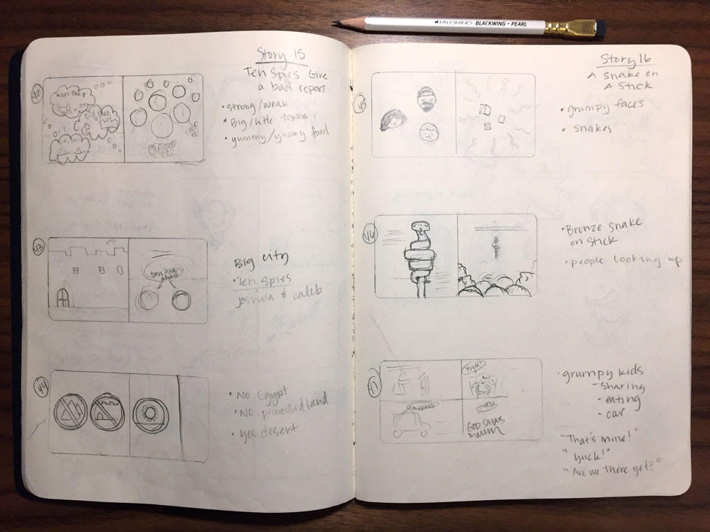
Trish: I always start by reading the manuscript and jotting down notes on the first imagery that comes to mind. Then I go back and create thumbnail sketches, a few inches large, for each page to get an idea of the general layout and flow. Sometimes that’s all I need before moving to the computer, but most of the time, I need to sketch out some of the details a little more clearly. Then I scan those and move to working digitally.
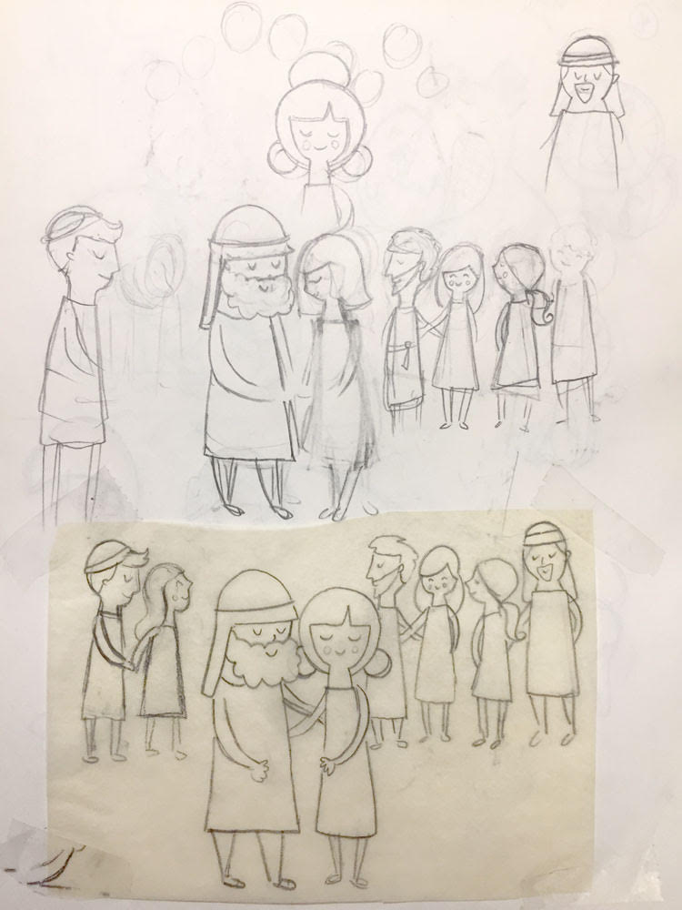
"I use a lot of tracing paper in my sketching phase. It allows me to make quick revisions without redrawing the entire thing."
Once in the computer, I redraw everything in Adobe Illustrator, which is a vector-based program, and gives me the most flexibility to make changes, incorporate type, and explore color. All of the textures in the illustrations were done with vector brushes in Illustrator.
I’d like to say I use a stylus and have a giant monitor, but I’ve been working on a laptop and trackpad for so long I’m really used to it, and frankly, I’m a little stubborn about learning new things. This project definitely tested the capability of my MacBook Pro, and I know it’s time to finally upgrade my setup. I’m sure once I make the switch I’ll be kicking myself for not doing it sooner!
Jared: Do you have a favorite illustration? (Is that allowed? Mine are Moses with the bronze snake and the disciples and Jesus with the 'Stop' and 'Go' signs).
Trish: I do have a few. I really enjoyed making the map of Africa, and John’s plate of bugs. I also really liked making the scene of the inside of the house in the Nativity story. I used to draw and imagine dollhouses like that when I was a little girl.
Jared: The Beginner's Gospel Story Bible is a really big book. What was the illustration process like for you? Specifically, how long did it take overall? In the acknowledgements, you also mention your kids' brutal honesty during the process (My kids were pretty brutal about the writing too). What were some things you learned from them and from others who offered feedback?
Trish: It was a huge undertaking! I started the illustrations in April of 2016 and the book was scheduled to be released Fall of 2017, which meant the whole thing needed to be to the printers in June of 2016. That gave me fourteen months to produce over 300 pages of illustrations, but if we missed the deadline, we would have had to push the entire project out a full year.
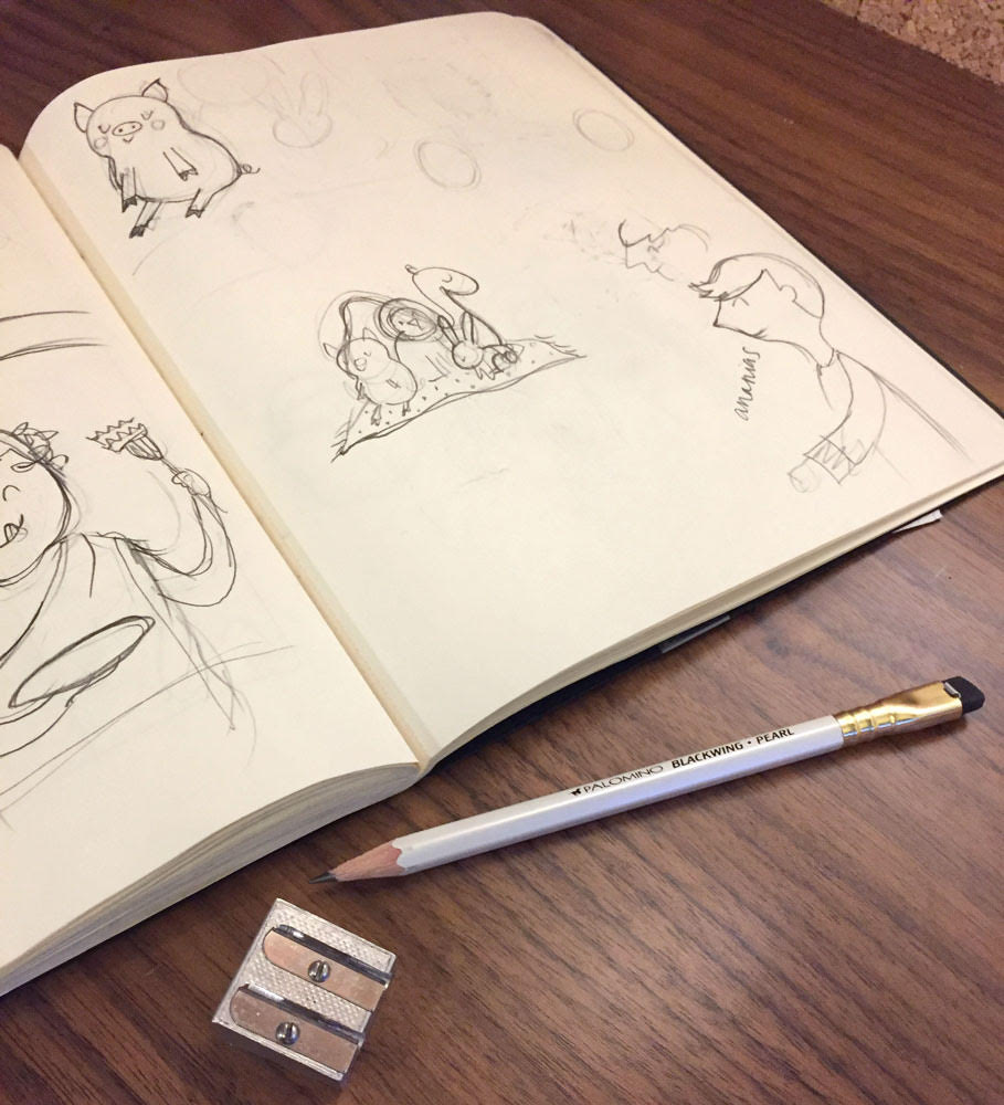
"I’m very picky about my pencils! I almost exclusively use a Blackwing Pearl by Palomino. They are so fabulous that they tend to wander off my desk and into my kids' hands all the time."
We broke the book into smaller sections and worked on each of those for about three months at a time, starting with sketches and moving to final artwork for the particular section. Once those were approved, I would receive the text for the next set of stories and start over with sketches for that section. This rhythm worked really well for me because I didn’t have to spend month after month doing sketches for the entire book, and I think it kept me from getting burned out. The only challenge to working that way was some of the details in my illustrations evolved over the course of the project, and in the end I needed to go back and refine some of my earlier work to match the style of the later sections.
My kids were really curious about the project, and were always excited to see which stories I was working on. My daughter was thrilled when Ruth’s story was added! It was interesting that they had very specific imagery in their minds of how each character should look, especially because they have been hearing these stories since before they could talk!
In the story of the Nativity, they were really bothered that some of the beds inside the house didn’t have heads showing, even though the text said all the beds were filled. I had implied people in the beds with a bump under the blankets, but they were insistent on heads. It wasn’t until the very last minute when my editor mentioned your kids had also commented on the same layout that I conceded and drew them in. Kids are often times very literal, and it’s easy as an adult to falsely assume they will understand the inferences. Of course, there were a few “that hair looks like noodles,” and “his head is way too tall,” comments.
Beds Before
Beds After
Jared: As a writer working with an illustrator, here's something I'm really interested about. What kind of feedback is most helpful? What kind of feedback is less helpful?
Trish: As an illustrator, I really like working from a blank canvas in my mind. My preference is to read the text without any suggestions of how the illustration should appear. It’s not that I wouldn’t agree with those, or take them into consideration, but once those suggestions have been made, it is much harder to envision something else. Typically, as soon as I start reading, my mind is already designing the page. If I see there are notes from the editor or author on the manuscript, I usually wait to read them until I’ve had a chance to jot down the key visuals, or make a quick thumbnail sketch.
Jared: If other illustrators or authors are reading, what are the top things illustrators should remember when working with authors? What should authors remember when working with illustrators?
Trish: I think it can be a tricky thing for illustrators and authors to work together on a story. I would imagine an author is picturing things a specific way as they are writing, but it’s not necessarily the same way the illustrator would see it. I think it’s important for illustrators to listen carefully to feedback and dig deeper into what might be causing any snags. Sometimes it’s as simple as color preference that could be affecting the way an author feels about an entire illustration.
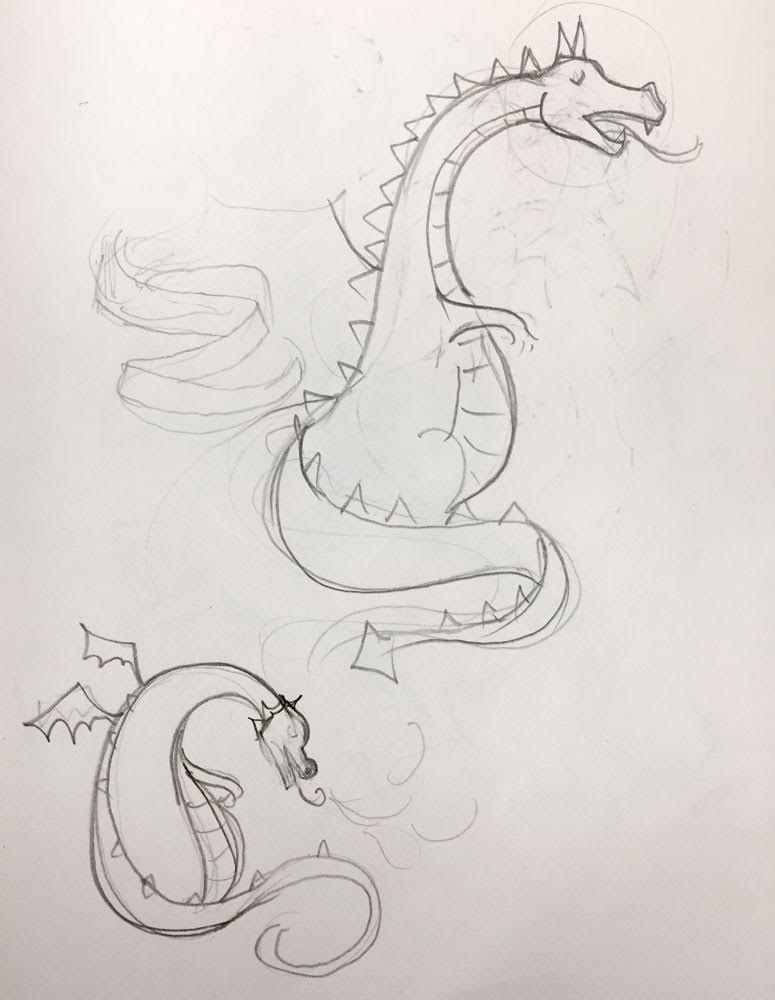
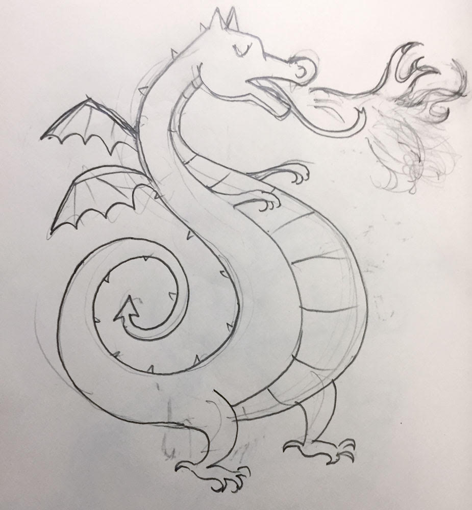
"TheSe dragon sketches are a good example of how a sketch evolves."
It is helpful if an author understands it’s not necessary to put every detail of a story into an illustration. That’s especially important for book covers. The purpose of the cover or illustration is to pique the interest of the reader, give visual clues to the main ideas, and set the stage for the story. I was so thankful everyone involved in The Beginner’s Gospel Story Bible was on board with doing very simple illustrations that were often very object-focused.
Jared: What did God teach you through the process?
Trish: I was constantly reminded that the simple truths of the gospel that we teach preschoolers are just as jam-packed with meaning, power, and comfort for adults. The story of Moses and the bronze snake was one that surprised me. I have skimmed that passage many times and hadn’t made the connection to the foreshadowing of the cross. I love that God’s word is constantly revealing new things that once discovered, seem so amazing, yet so obvious!
Even though my kids are older than the target audience for The Beginner’s Gospel Story Bible, I know they have both benefited from the truths that are highlighted in each story, too—especially when they can have a finished copy without all of my post-it notes and scribbles all over the place!
I'm so grateful Trish to the time to answer these questions. What questions do you have about illustration? Leave some thoughts in the comment section below.


